Project Scope: Brand Strategy, Research, Brand Identity and Visual Language
Date: August 2020
Sector: Home Decor & Furnishing
Pastiche
BRIEF: The world of Pastiche is a riot of textures, materials, and creativity oozing out to form a union of craft, culture, and aesthetics. Made by craftsmen from the interiors of India, their products are sure to find a place in your home and your heart.
APPROACH: As an extremely dynamic brand that offers a wide range of crafts, Pastiche called for an amalgamation of natural textures, colours, and contemporary settings. Every Pastiche product is carefully handmade by the local craftsmen, which had to be translated into their brand design.
How could we create a consistent language for a brand that uses traditional crafts from all around the world to make contemporary products?
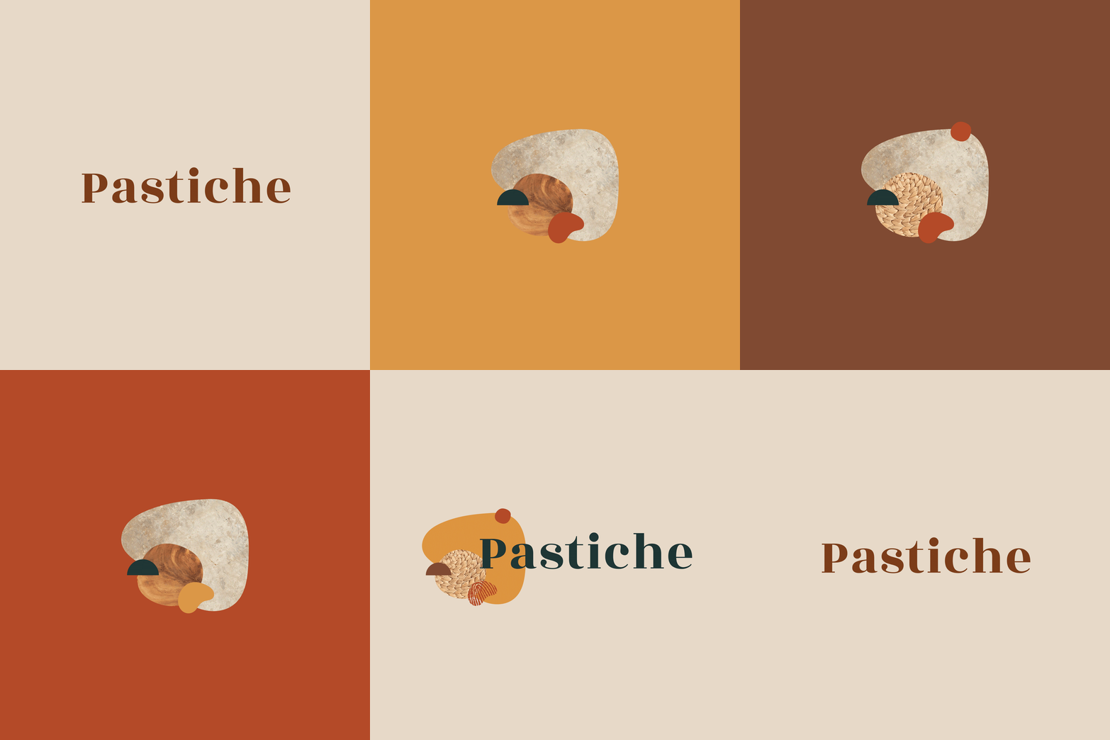
The first hurdle we encountered was to find a way of representing very different crafts through a unified visual entity and depicting Pastiche’s story of how artisans from across the country make contemporary products. Since each product had a different story to tell, we developed a brand pattern that showcased how different elements combine together to form something new.
Each design element used was made of a different shape, size, and texture to mirror the diversity of their products. To signify how each product is handmade, we also integrated a fingerprint which became one of the most vital design elements.
All these elements combined together formed the logo for the brand Pastiche.
To ensure there was uniformity in the design, we decided to keep the main elements constant throughout the brand collaterals. We also decided to keep the base a neutral colour while playing with different forms, warm colours, and textures, again to reiterate the unity of the brand’s vision and the variety of the product types.
Later, we planned their Instagram launch to maintain the visual language across the consumer touch points.
Working alongside Sejal was a breeze as she was extremely cordial and understanding all through the project. Moreover, her patience is commendable. She very carefully and intently tried to understand Pastiche’s ethos and brand language and created the logo keeping in mind, every aspect, and criteria we had put forth.
We are not only happy but content with her deliverables. Sejal went out of her way to research, ideate, and develop ideas as per our needs and visual language. Kudos to a great designer!
- Aditi Kabra, Founder of Pastiche


