Project Scope: Brand Strategy, Brand Identity and Communication Collaterals
Date: January 2020
Sector: Manufacturing and Industrials
Cheviot Company Ltd.
BRIEF: Formed in 1879, Cheviot Company Ltd is an Indian manufacturer, supplier, and exporter of jute yarns and fabrics. They wanted to refresh their old brand identity and build a new, sophisticated, and relevant brand presence that resonated with their standing as one of the top five jute industries in India.
APPROACH: As a 120+ year old company, Cheviot has garnered an unparalleled brand legacy and heritage. Its success over the past century demanded a brand identity that projected its timelessness and introduced a meaningful and unique brand presence. Keeping the company culture and beliefs in mind, we redesigned their brand language to make it align with their future vision.
Challenging as it initially seemed to renew the branding elements while restoring its integral components, it was an interesting process to study Cheviot’s core values and brainstorm on ways to depict them visually.
It was important that the new identity resonated with the company and illuminated the brand values eloquently.
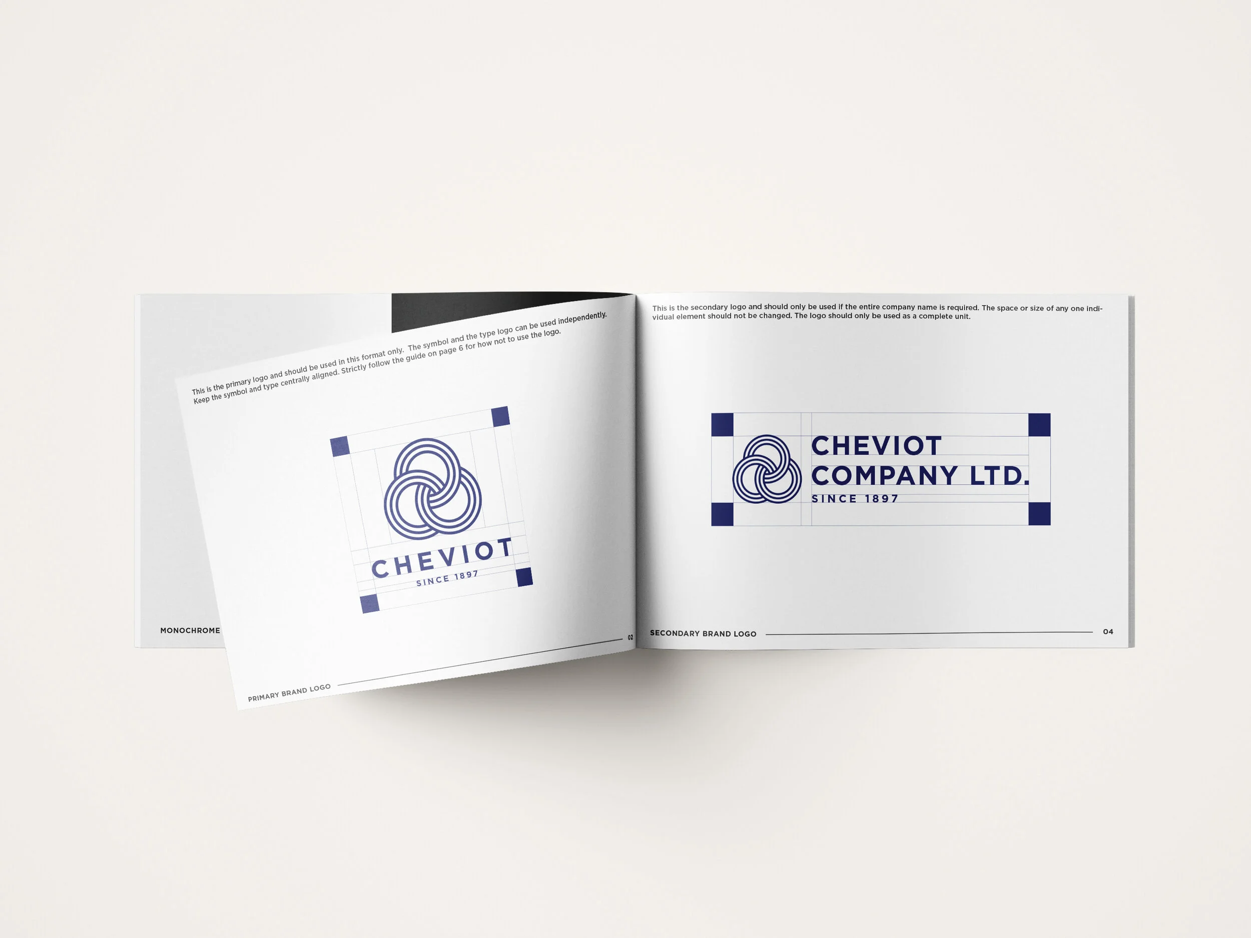
The structure of the symbol was derived from Cheviot’s old logo which was inspired by the three-leaf clover and the entwining of jute. The new logotype is a celebration of its strong heritage: where the three circles reinforce the company’s values of strength, boldness, and confidence.
The primary colour is borrowed from the star in the Indian flag used during the British Raj. The colour palette includes a shade of navy with hints of ivory keeping it royal, clean and simple.
Their new wordmark was also designed to be flexible and adaptable for its many different applications. The renewed simple and minimal brand language was seamlessly carried throughout the initial print and digital brand activation elements.


